When you are working on CSS, you have three ways to place HTML display divs side by side. These methods are as follows:
Float Method
Let us start from the float method. Here, we use the following HTML markup:
<div class="float-container">

  <div class="float-child">
    <div class="green">Float Column 1</div>
  </div>

  <div class="float-child">
    <div class="blue">Float Column 2</div>
  </div>

</div>
You should know that the (.float-container) is just a parent element. It has both (.float-child) elements.
For getting two divs side by side, you must apply the following CSS rules:
.float-container {
    border: 3px solid #fff;
    padding: 20px;
}

.float-child {
    width: 50%;
    float: left;
    padding: 20px;
    border: 2px solid red;
}
The code in the result will look this:
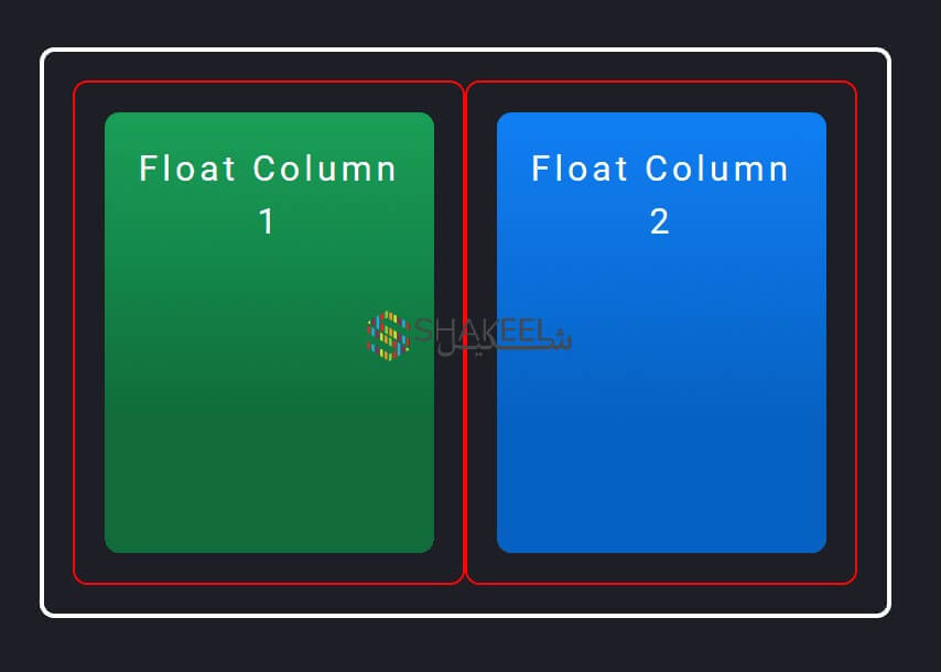
In this picture, you see borders and padding which makes it even clearer. There is a white outside border which is the result of (.float-container) div. It has padding of 20px.
The thin red border that you see is the result of (.float-child) element. The child elements of (.float-child) makes the actual color blocks.
We are using the float property as it will position the divs side by side. You must note that both of them are floating to the left. So, if there’s enough space, then both of them will display side by side. We ensured it by giving 50% width to both (.float-child) divs.
To further add the space between both divs, we added padding in our .float-child div.
If you need any help, you can hire a freelance web developer in dubai to handle your website issues.
Adding space between columns
The color blocks must have an outer div (.float-child) to add space. It will further ensure that both blocks fit well side by side.
Well, let us play with the code by adding just one (.float-child) divs and not adding any padding. Instead, we will add a space and put a (margin-right) value on the first block.
<div class="float-container">

  <div class="float-child green">
    Float Column 1
  </div>

  <div class="float-child blue">
    Float Column 2
  </div>

</div>
.float-child.green {
margin-right: 20px;
}Both elements of (.float-child) will take half of total width. However, the green element will also come with a margin of 20px.
In general, it means that our blocks will have a width of 50% + 20px + 50%. Since the value exceeds 100%, means there will be not enough space for them to show side by side. As a result, the blue block will show under the green block and will be floated towards the left as described.
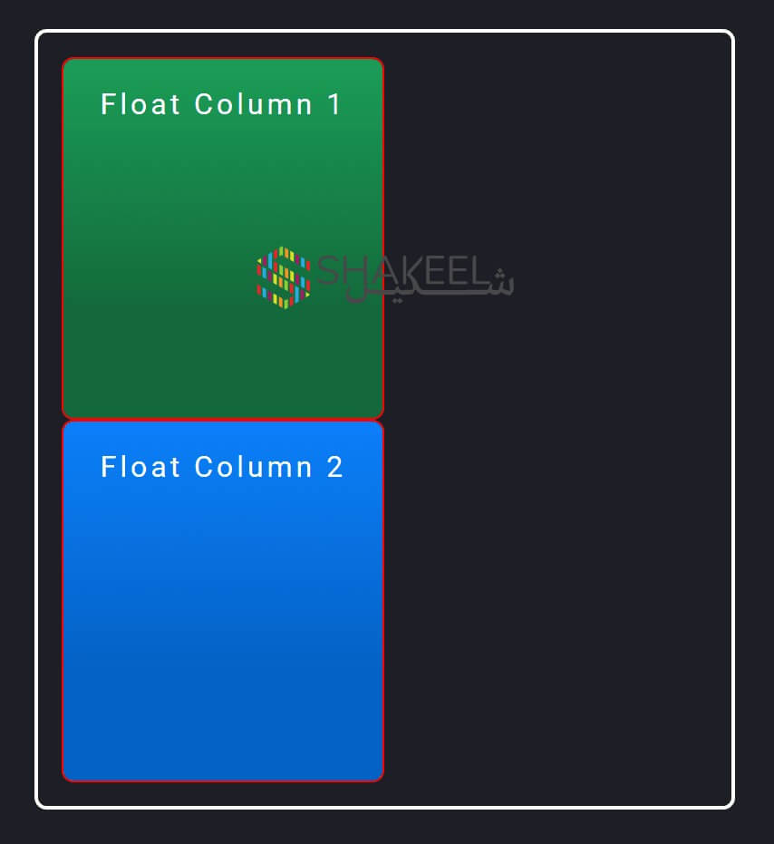
You can try to reduce the widths to fit them. However, it will still not ensure that they will fit well. Like using 48% width will also not fit them.
For this reason, we love to keep the width 50% with padding that adds space between both divs. There are many latest methods in CSS that will allow you to place divs side by side and you have lesser dependency on float.
Flexbox Method
Let us check the second method by which we can align two divs side by side.
<div class="flex-container">

  <div class="flex-child magenta">
    Flex Column 1
  </div>

  <div class="flex-child green">
    Flex Column 2
  </div>

</div>
.flex-container {
display: flex;
}
.flex-child {
flex: 1;
border: 2px solid yellow;
}
.flex-child:first-child {
margin-right: 20px;
}In this method, we set (display: flex) on the parent element (.flex-container) to turn the flex on.
In every (.flex-child) element, we set (flex: 1) The number acts like a ratio in width comparing the child in the parent flex element.
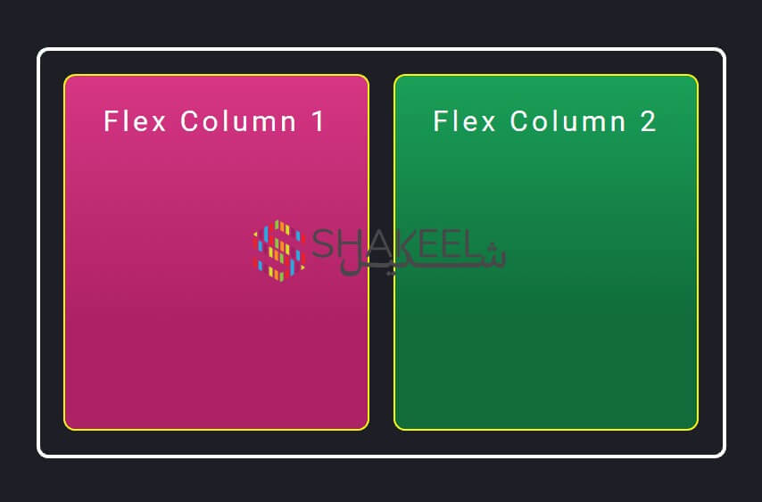
Being the same means that the available space will be divided equally between both child elements. So, let us check the result of both codes.
Adding space between divs
In this method, we have added the space between them by using (margin-right: 20px) which we added to only the first element (.flex-child). Since flexbox is intelligent, it will consider those 20px while dividing the rest of the width between these elements.
So, unlike float, you won’t have to calculate exact pixels and flex will do the job for you. In the case of multiple elements, we don’t know the exact points where we need the space.
In the current case, if we want the stack to be divided into two, we will just take out the (margin-right) from margins. You can also add an outer element of padding for (.flex-child) elements. This works similar to the float method.
It might not work 100%, but in most cases it works. So, if you want to create more complex responses, you must consider this fact.
CSS Grid Method
Let us move to the third method, where we will try to add divs by CSS Grid method.
<div class="grid-container">

    <div class="grid-child purple">
        Grid Column 1
    </div>

    <div class="grid-child green">
        Grid Column 2
    </div>

</div>
.grid-container {
display: grid;
grid-template-columns: 1fr 1fr;
grid-gap: 20px;
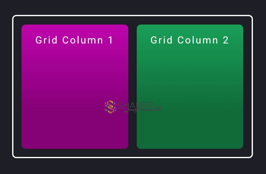
}The code will look similar to this one:
A big difference here is that you had to decide about the grid template first. How many columns or rows will make up the layout, you have to specify it first.
Since we needed two columns with equal width, we turned (display: grid) grid on inside the parent element of (.grid-container). The number of columns that we need in our layout is added in the (grid-template-columns) property.
Since we want two columns of the same width, we set it to (1fr 1fr). The browser will create a two-column layout and from 1fr, it will take 1 fractional unit space.
Adding space between grids
We love CSS for a big benefit. The benefit is that we don’t need the usage of padding or margin here. The (grid-gap) will automatically add spaces in the template.
In this example, we set the (grid-gap) to 20px. From this information, the browser will get that we want 20px space between all the items. It will add the space whether the grids are side by side or stacked.
We used the parent element (.grid-container) to set all the CSS properties. There was no need to write any CSS for the child elements in the (.grid-child).